Plotting maps
Jump to navigation
Jump to search
Introduction
R can plot very nice maps. I decided to give up plotting maps in grass. The ps.map function is very powerful, but hard to remember for my not-so-frequent use. I use the grass interface but R imports very many raster and vector formats via the rgdal package.
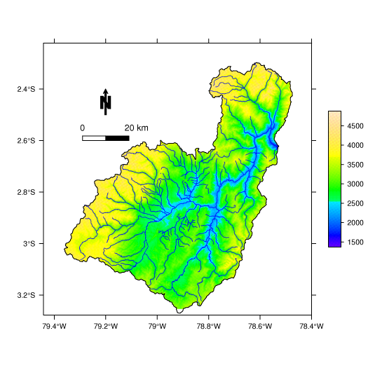
Plotting GIS data is very nicely implemented in the sp package, part of the spatial data in R project, but getting your plot the way you want is quite challenging. Here is an example.
Required packages
spgrass6 reads data from the GRASS database, use rgdal for other formats. sp implements spplot, and lattice is used to define the colours (trellis.par.set).
  library(maptools)
  library(spgrass6)
  library(lattice)
Plotting a map
 # read the DEM and the vectors (for importing other formats see the rgdal package)

 paute_DEM <- readAsciiGrid("paute_DEM.arc", proj4string = CRS("+proj=tmerc +datum=WGS84"))
 paute_rivers <- readShapeLines("paute_rivers", proj4string = CRS("+proj=tmerc +datum=WGS84"))
 paute_borders <- readShapeLines("paute_borders", proj4string = CRS("+proj=tmerc +datum=WGS84"))

 # set some nice topographic colours, if you want dull greyscale colors, use:
 # colours <- gray(c(rep(100,10),100:15)/100)

 colours <- terrain.colors(1000)
 trellis.par.set(sp.theme(regions=list(col = colours)))

 # define the objects necessary to draw a scalebar and north arrow:

 scale = list("SpatialPolygonsRescale", layout.scale.bar(height=0.05), offset = c(-79.3,-2.45), scale = 0.18, fill=c("transparent","black"))
 text1 = list("sp.text", c(-79.28,-2.45), "0")
 text2 = list("sp.text", c(-79.1,-2.45), "20 km")
 arrow = list("SpatialPolygonsRescale", layout.north.arrow(type=1), offset = c(-79.2,-2.35), scale = 0.1)

 # define the vectors:

 rivers  <- list("sp.lines",paute_rivers, col="blue", lwd=0.5)
 limits  <- list("sp.lines",paute_limits, col="black", lwd=1)

 # and finally plot the map:

 spplot(paute_DEM,draw = T, colorkey=list(space="right", height=0.5), cuts=127,
    scales=list(draw=T), sp.layout=list(scale,text1,text2,arrow,rivers,limits))
Good to know:
- cuts defines the number of colour intervals. The default is 15 and that's not really nice for continuous DEM images
- the colorkey options are part of levelplot {lattice} and are quite customizable
